Sorted by
date descending
AGA/Edmonton
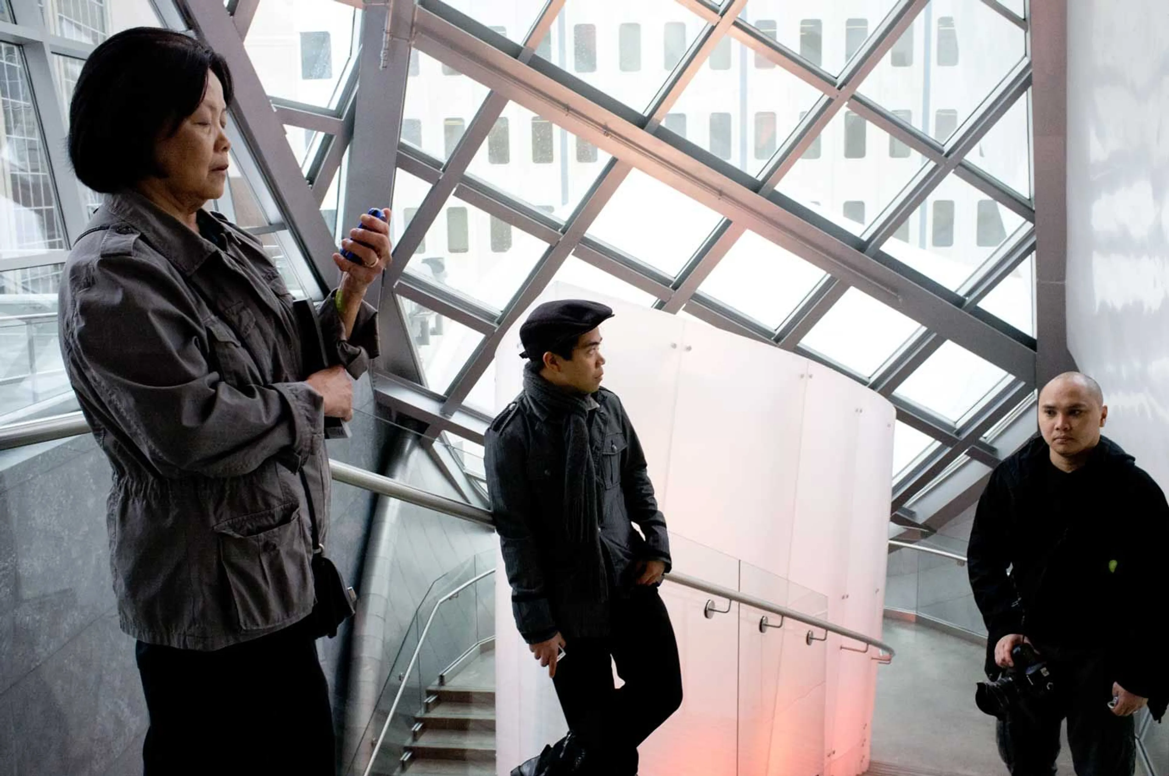
Photo: curved metal, glass windows, and spontaneous photo ops in Edmonton, 2011.
I really wish I could be that kind of person who sees derivative architecture and deride it as a hacky attempt at being relevant in a world where relevancy has lost all meaning. As an aside, I wish my Google search results were really relevant to me and not to the corporate overlords who had the money to shell out on sponsored ads.
I think this is in part related to society throwing the "term" relevancy when they mean "unique." People like to hate on brutalist architecture because they're too ubiquitous in our urban landscape, or that they aren't "organic" enough - though, I'd like to point out that there's nothing organic about human construction. The sort-of opposite style to the geometric patterns and bare-bones structures of brutalism might be something deconstructionist, like in the works of Frank Gehry (think Walt Disney Concert Hall in LA, Art Gallery of Ontario in Toronto, and the Guggenheim Museum in Bilbao, Spain). Think: no right angles. People who listen to 100% Invisible (or actual architects), please tell me how wrong I am.
Enter the Art Gallery of Alberta in Edmonton, Canada that for the architectural snobs combines brutalism and deconstructivism into one city-block package. The wind-swept zinc and stainless-steel design of the main atrium intends to emulate the undulating waves of the aurora borealis, while the brutalist halls containing the main exhibition spaces are a remnant and reminder of the previous art gallery built in the 1960s. These kind of metaphors and narratives are the kind of thing that art galleries reek of and why we pay good money to stand in front of a painting to try to figure out what was going through the artist's mind.
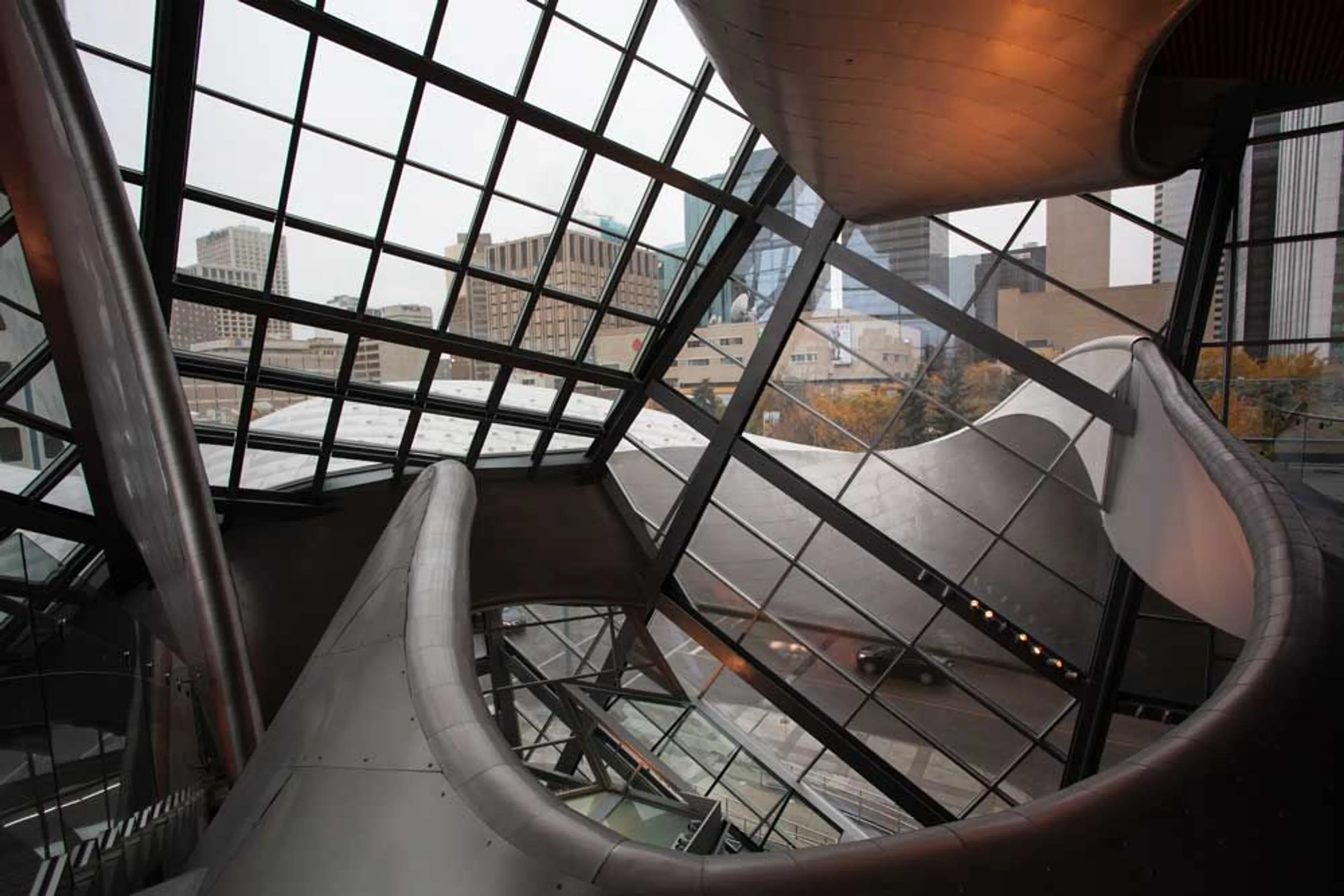
They also make for pretty good photo ops. We just happen to be walking up the stairs to the top floor of the gallery and were just taking in the view of those "wind-swept zinc and stainless-steel design" - or maybe just me as my mother was busy on her phone and my cousin was simply walking up the stairs.
There are, however, those who can't see past the wind-swept design as a unique placeholder for the aurora borealis; instead, for them it's a reminder that Edmonton, a town with around a million people and straddling the 53rd north latitude, tried to stay relevant with a Gehry-inspired - nay *copied* - design and somehow didn't do it properly. It's my guess, though, but it seems to be the common thread amongst my friends in Edmonton who are not fans of this design. Maybe it's that the art gallery isn't well known, or that Edmonton doesn't "deserve" a design like this. Maybe it's a case that someplace else has a fancy well-known building and Edmonton had the nerve to "copy" a design. I don't think this particular argument is fair, or even true as other than the curved sheet metal design, there's nothing else similar about the AGA's design and other more famous works.
But that's just speculation on opinion. And my opinion is I'll take this gallery's wind-swept design for what it is.
Author: Francisco Tenorio
Originally Posted: 2020/02/03
Last Updated: 2024/03/03